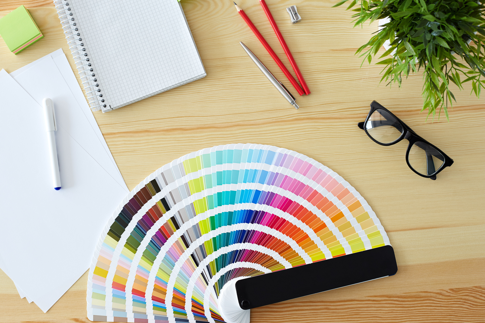
There’s no better way to completely transform a room than by injecting some fresh new colour to spice things up. With the bold spectrum that has been trending in Australia this year, there has never been a better time to be daring and express your creative side around the home.
Unleash your flair with some of our favourites below.
Blackest Brown
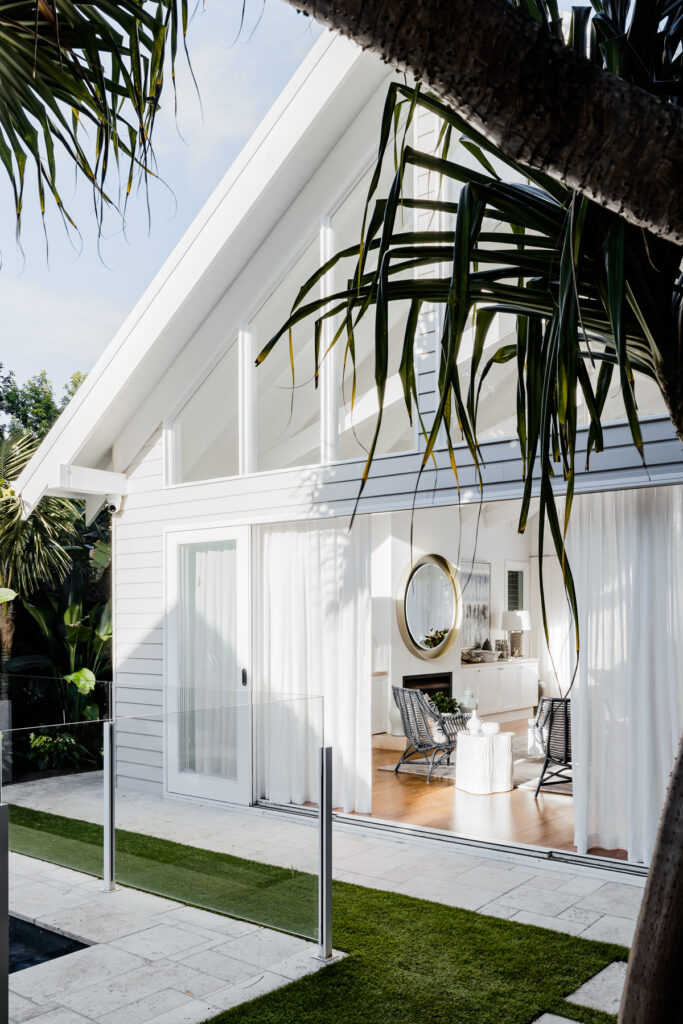
Greys and blacks were once colours we wouldn’t dream of letting near our walls, but those days have been left in the shadows. This year has seen deep tones come out from the home theatre and command the walls of the bedroom and study. Darker options are fast becoming the new ‘neutral’, with designers seeing them as the go-to choice that pairs with almost everything. Marry Blackest Brown with concrete, timber or brick for a modern twist on the past.
Cherished Gold
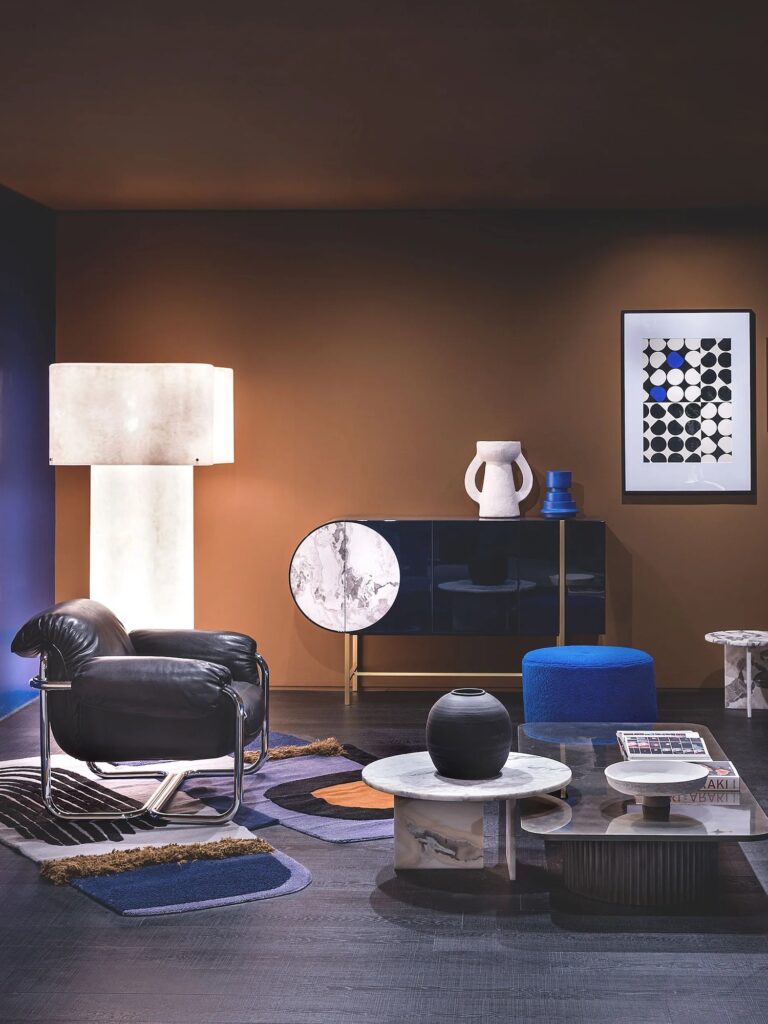
Cherished Gold was Dulux’s choice for the 2016 colour of the year, and with good reason. When matched with pastel blues and regal shades, this metallic tone can illuminate otherwise restrained designs. Channel your inner Midas Touch by choosing accessories and furniture with a gold twinge to ignite retro, yet elegant sparks around the room.
Rose Quartz
Pastels are staying put this year, with the romantic side of the spectrum proving particularly popular. Incorporate washed-out blush tones to create decadent walls and opt for muted rose hues for linens and soft furnishings. Rose Quartz provides a persuasive, yet gentle tone that conveys compassion and a sense of composure, so it’s no surprise it was named Pantone’s Colour of the Year.
Limpet Shell
Aquatic features have always been around in the surfy Australian palette – turquoise is commonly used to bring a youthful, jovial quality to the interior. However, this year’s restrained marine hues, such as Limpet Shell, come with a self-assured maturity that may cause you to reconsider the colour family. Team with silvers and timber to provide a striking contrast, or make it the focal point of walls to evoke a feeling of tranquility that no other colour can match.
Warm Taupe
A timeless neutral, Warm Taupe provides a solid foundation that allows you to experiment with more vivid counterparts. It’s a great all-rounder that can assimilate into almost any scene, breathing an organic, earthy quality into any room. Perfect for those quirky kitchens and vintage studies.
If you need a helping hand bringing colour into your home, renovate with Darren James interiors today.