Do you ever see a design online with beautiful joinery and ask yourself – ‘What is that colour!?’
Don’t worry we do the same thing!
So today we’re going to share an exclusive of some of our favourite project colours with you. As designers we recommend getting up close and personal with the colours you are choosing – so view them in multiple light settings, get a nice large sample and always view it against the other elements in your space like your benchtop material, hardware and wall paints. This will help to gain confidence in your selection.
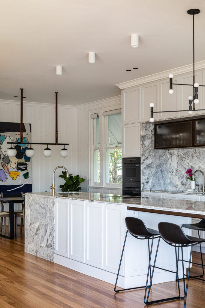
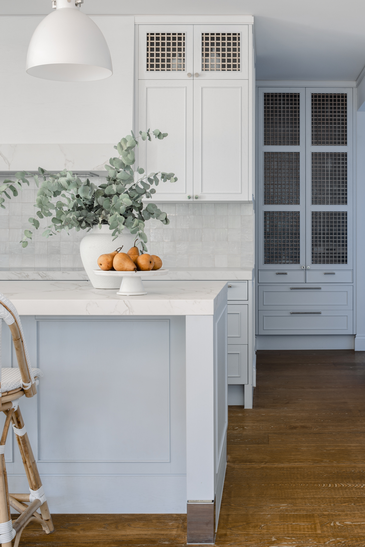
Southport House
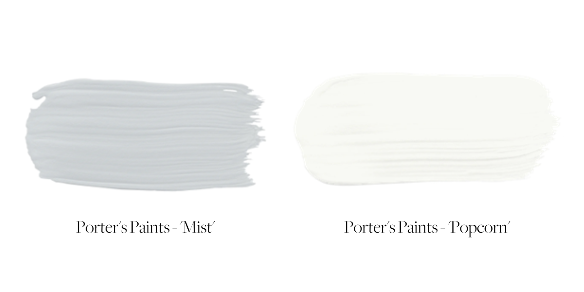
Our Southport project called for a soft cool palette to compliment the light filled space and warm timber floors. So we selected a two tone combination of Porters Paints ‘Mist’ below bench and ‘Popcorn’ for the remainder to provide a relaxed calm in this gorgeous family home. According to Porters Paints colour experts, Mist is ‘a subtle and serene pale grey with a hint of cool blue’ while Popcorn is ‘the perfect classic natural white, very neutral in tone’. We think you’ll agree this combination has created a beautiful, relaxed vibe in a Cape Cod classic.

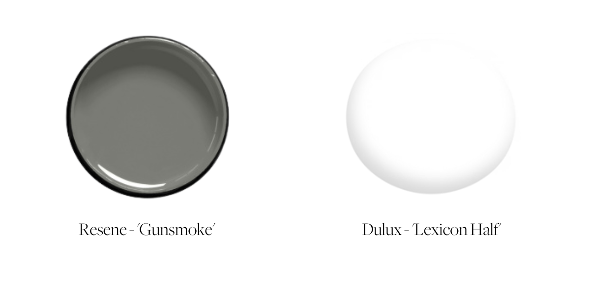
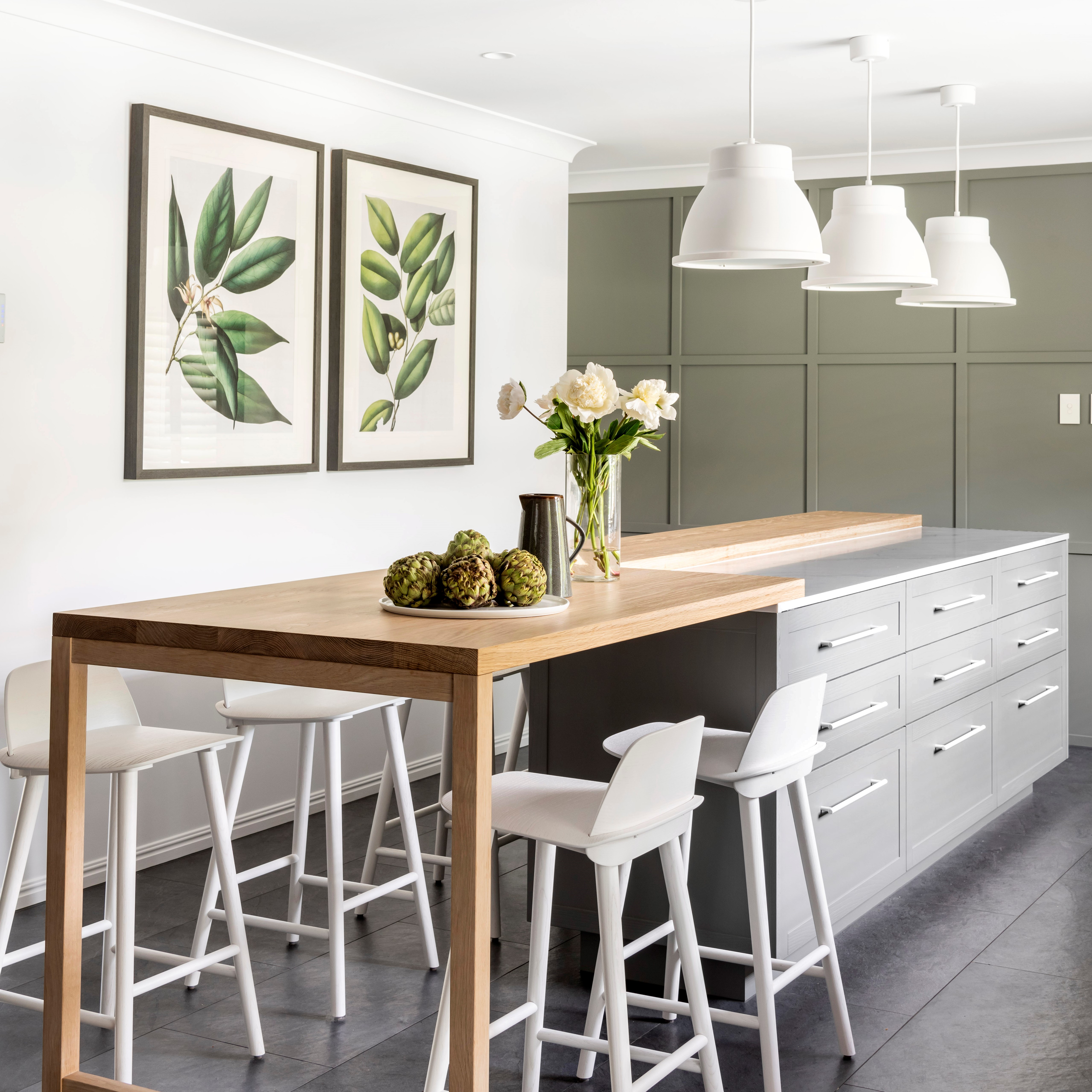
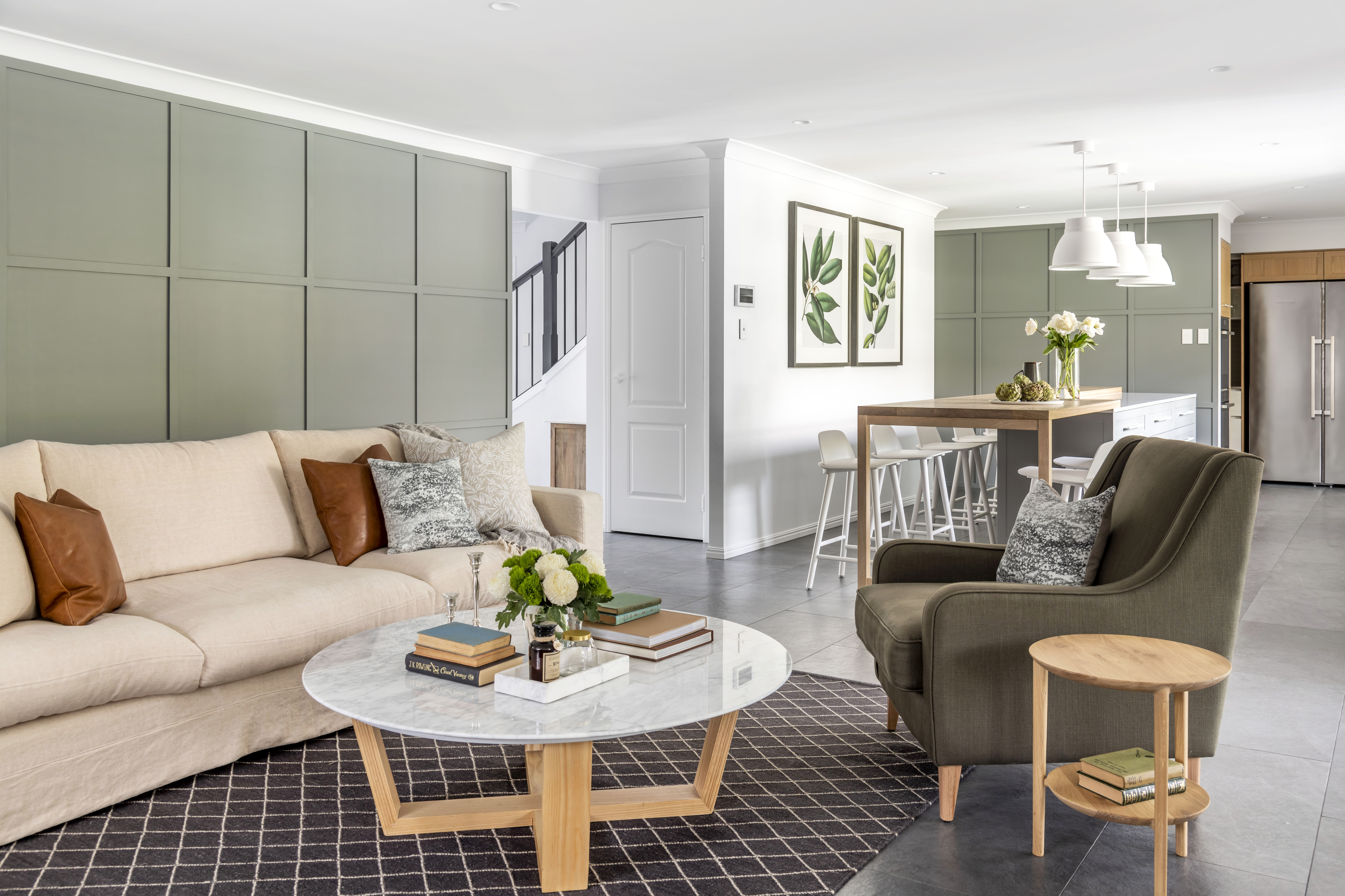
Albany Creek House
We selected Resene ‘Gunsmoke’ for the joinery and profiled wall in the kitchen / living space to warm up this beautiful Albany Creek home. This subtle green gray brings the outdoors in, and gives this space a soft grounded feel, contrasted with the fresh Dulux ‘Lexicon Half’ on the walls with pops of oak timber to tie the space together. You can also sneak a peek through the doorway at the Resene ‘Nocturnal’ painted stair balustrade that we all loved!
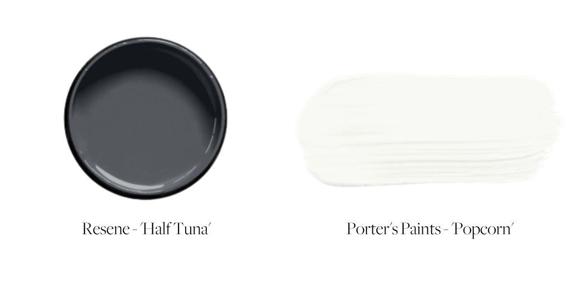
Gordon Park House
Resene ‘Half Tuna’ has brought so much personality into this kitchen in our Gordon Park project. Contrasted with Porters Paints’ ‘Popcorn’ the juxtaposition adds depth and sophistication to this stunning space. This complex blue is somehow earthy yet energetic, and perfectly compliments the oversized woven pendant light and timber bifold doors + floors. This is definitely a kitchen we would love to come home to!
Red Hill House
Our Red Hill project called for modern elements whilst still respecting the character of the original Queenslander home. The subtlety of Porter’s Paints ‘Mountain Ash’ gave this kitchen a sophisticated persona, while allowing the feature lighting, cathedral glass cabinets and stunning marble benchtops to take center stage. ‘Mountain Ash’ is a beautiful muted off white which would sit well against both warm or cool toned palettes.

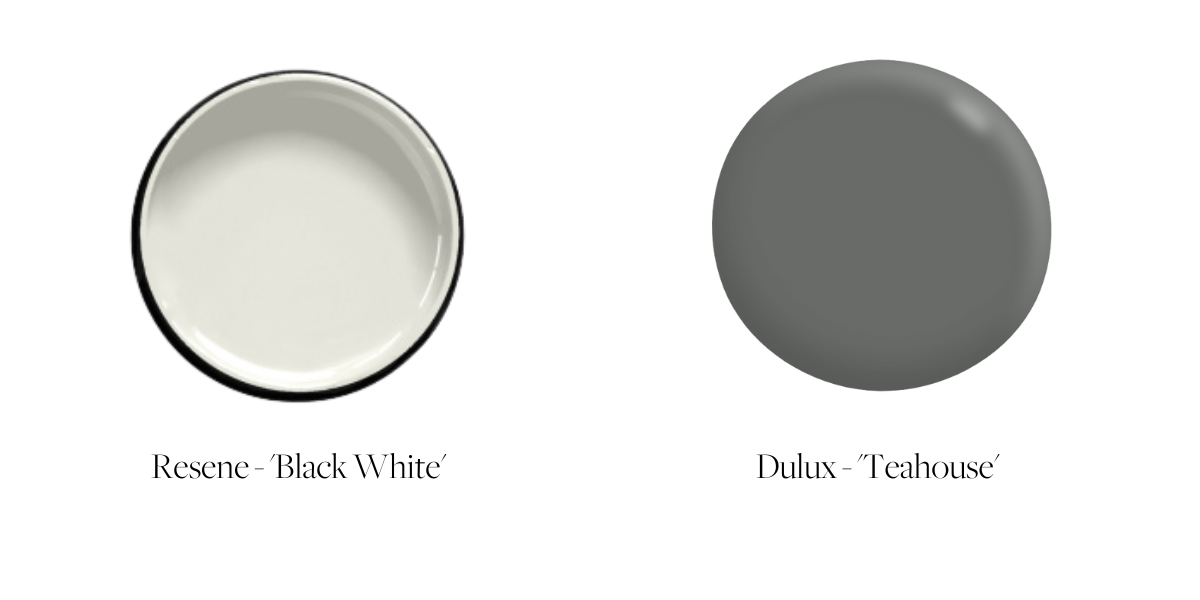
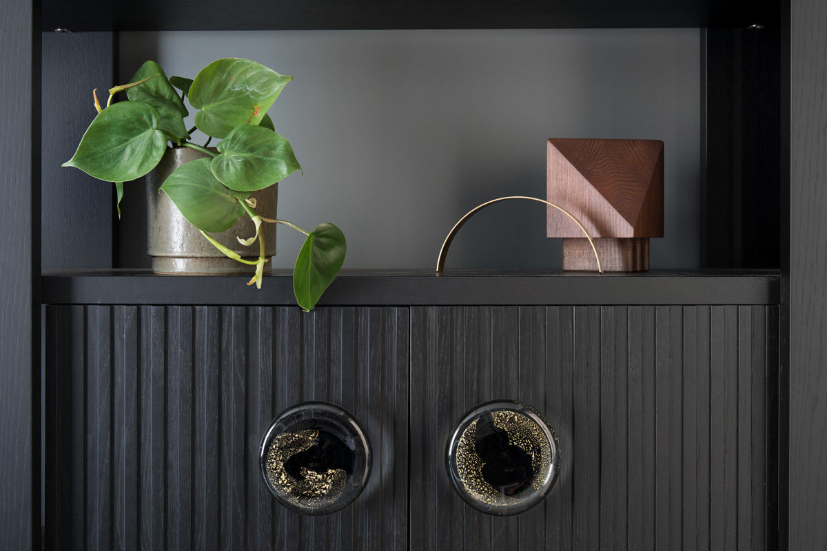
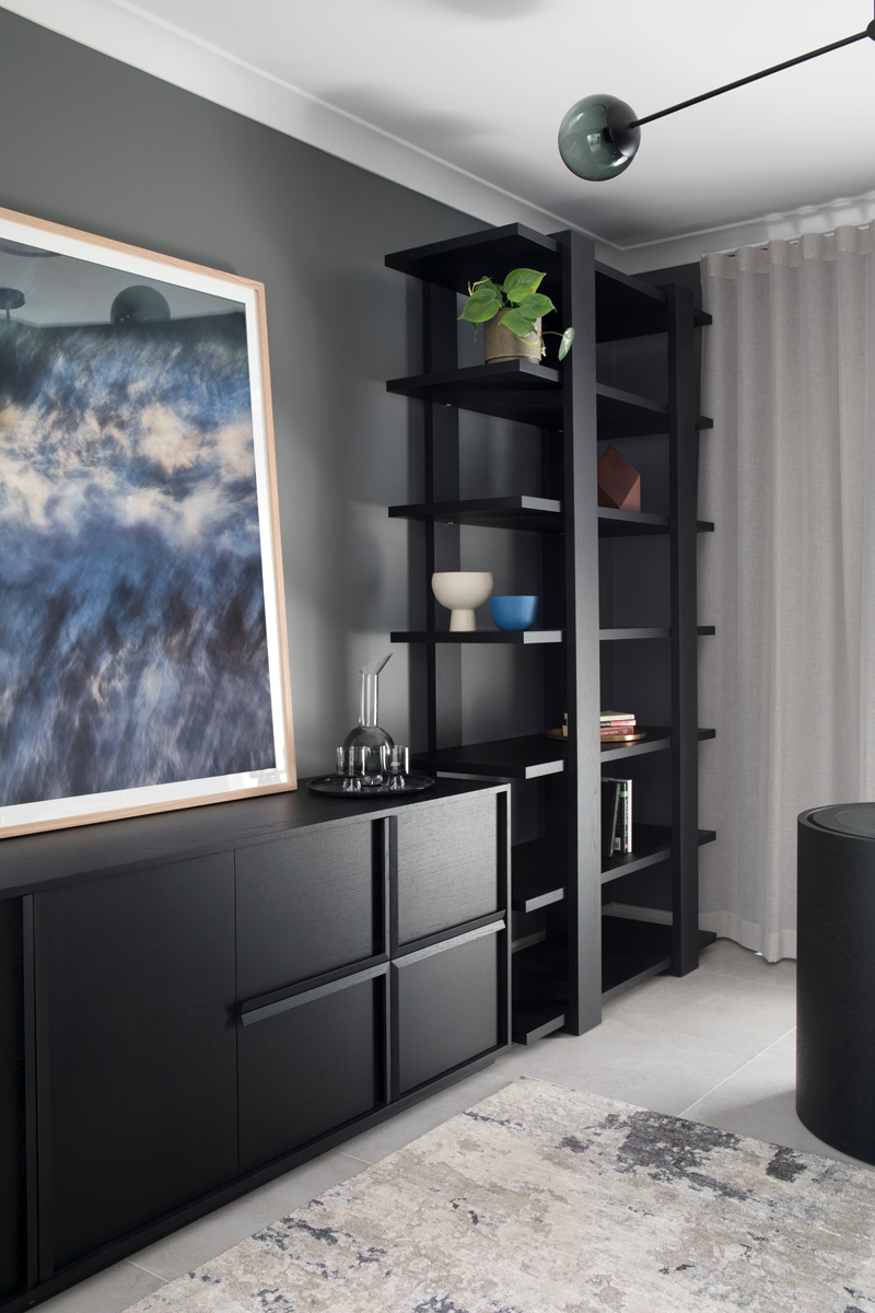
Varsity Lakes House
Our Varsity Lakes house was light and bright with Resene ‘Black White’ used throughout the interior. The study however, called for a moodier vibe that would work perfectly with the custom smoked oak Zuster furniture. Dulux ‘Teahouse’ was chosen for its dark, warm, room transforming abilities and we think the end result is incredibly sophisticated!
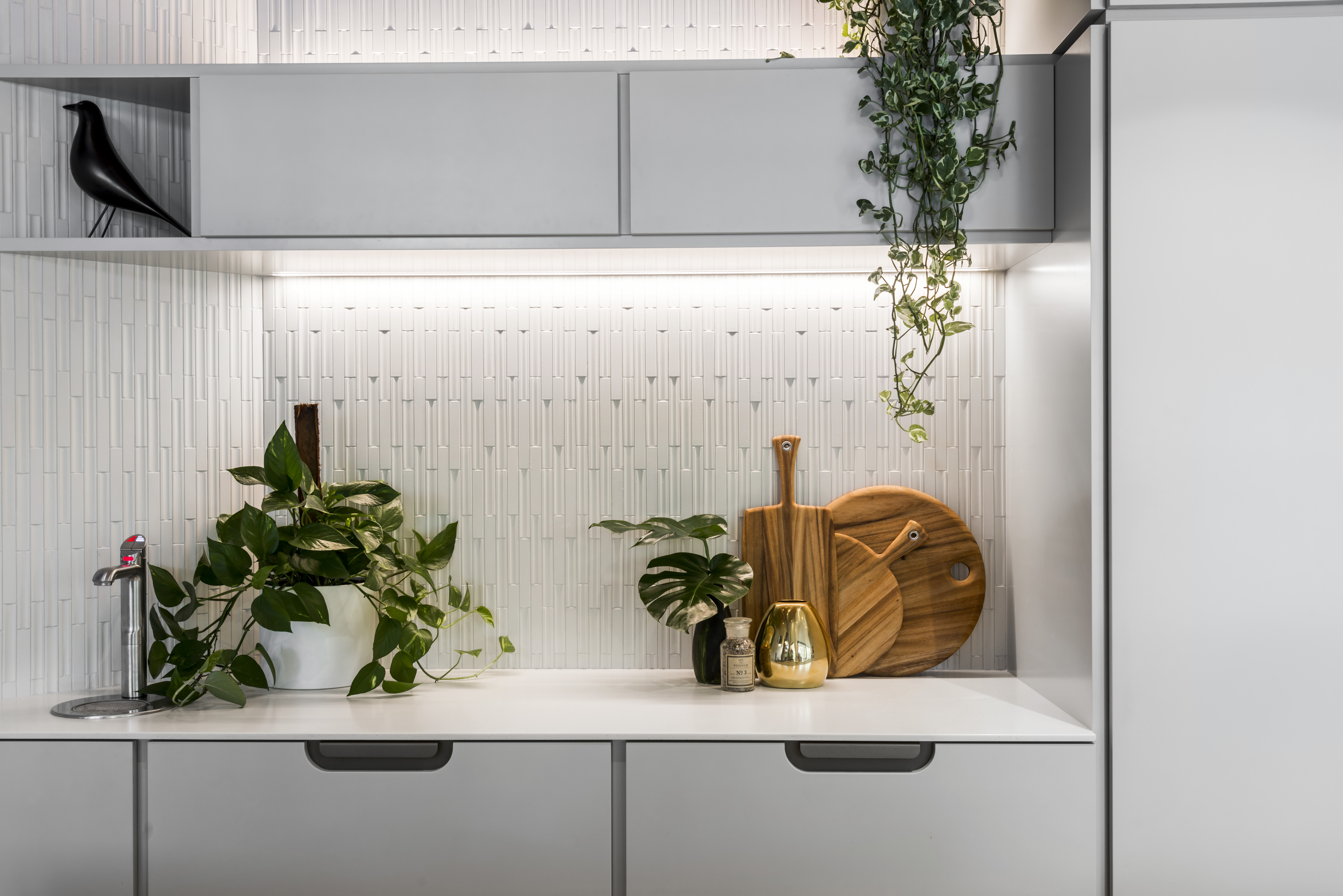
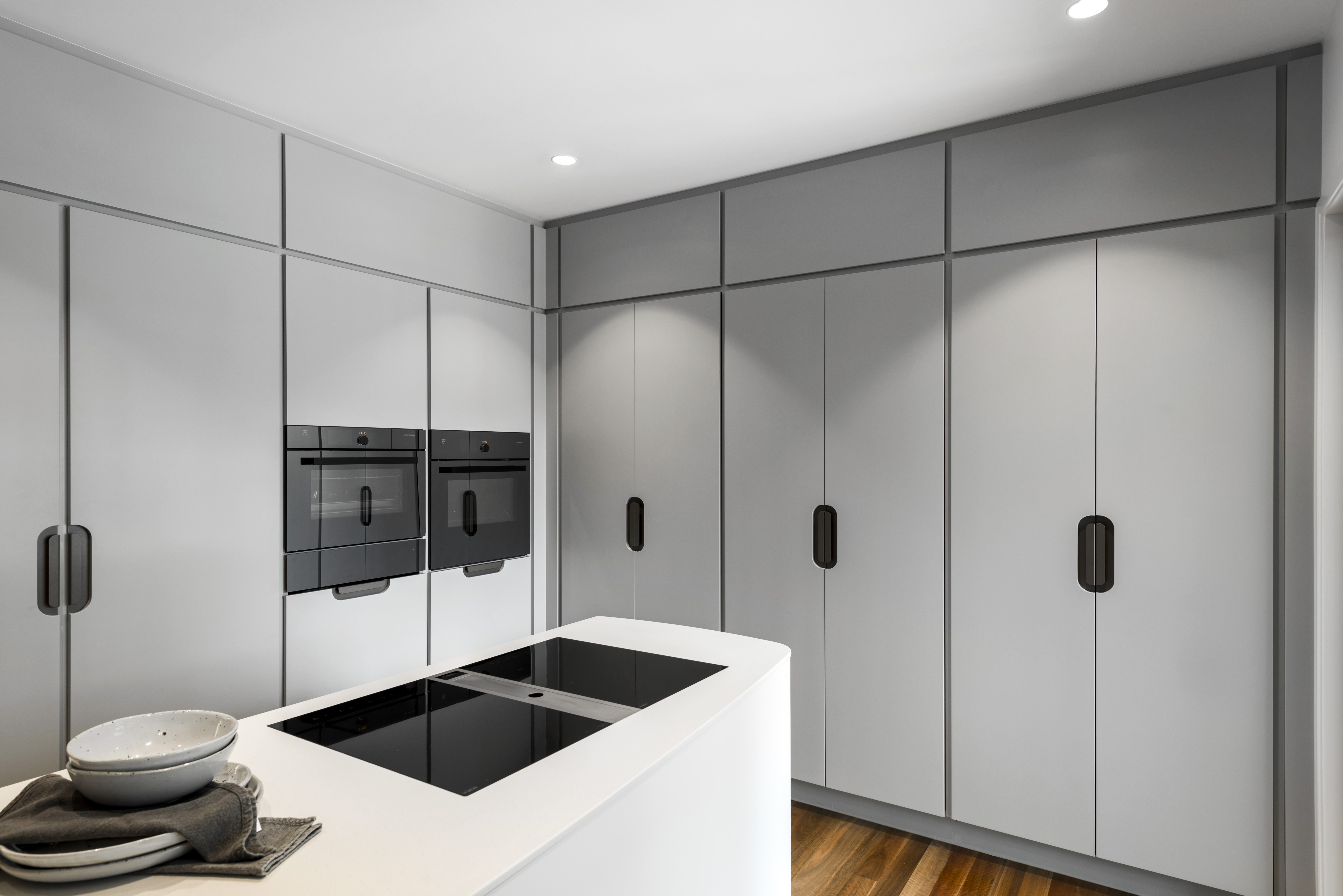
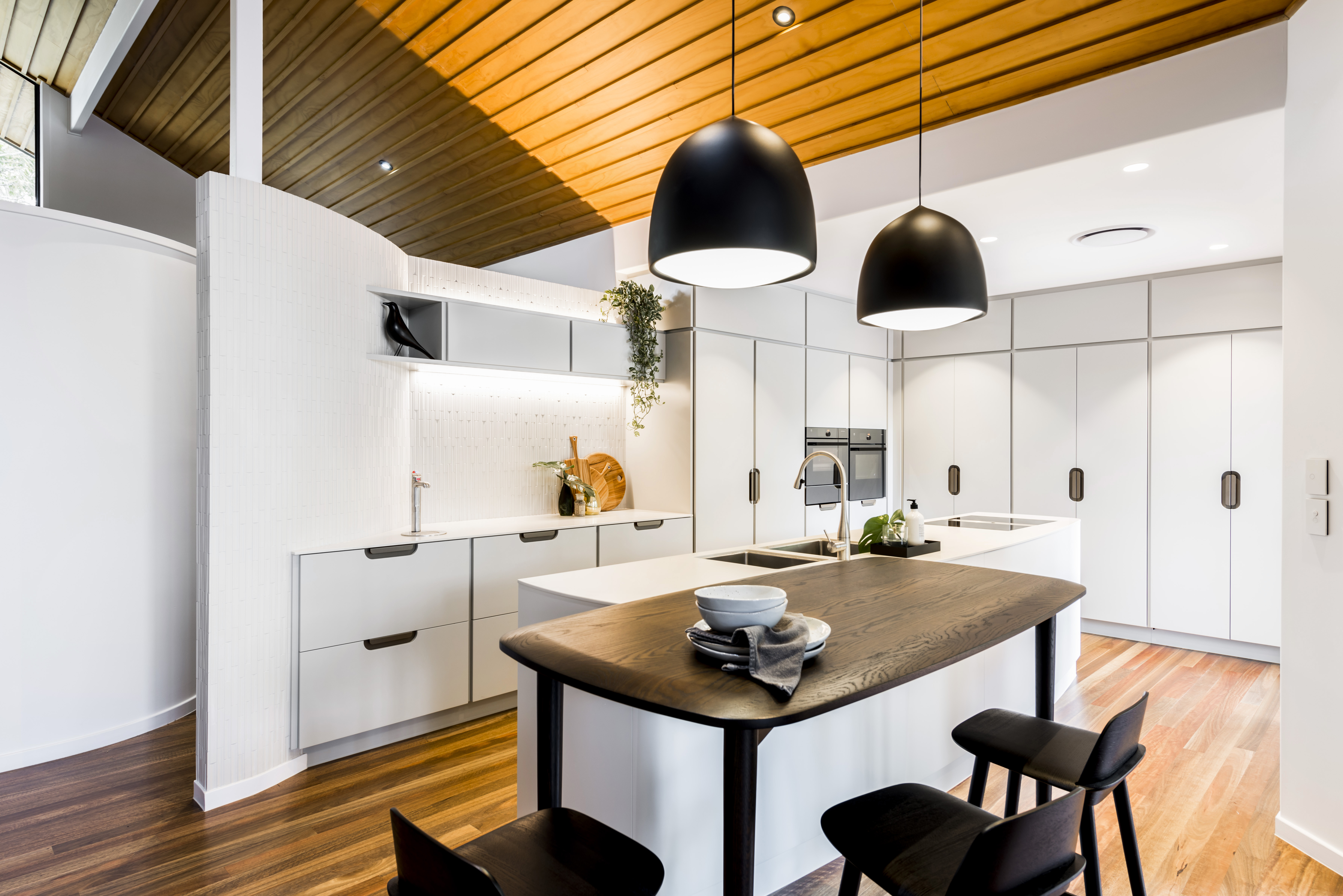
Chapel Hill House
Our Chapel Hill House kitchen called for an approach that highlighted the stunning architectural elements of this home whilst also incorporating a kitchen that ticked all the boxes in terms of form and function. The set back shadowline design of the cabinetry was beautifully highlighted by the colour choice, Dulux ‘Pukaki Double’. You really notice the soft gray and blue undertones in this kitchen, which are contrasted by the white finger tiles and timber elements to create a kitchen that feels as tranquil as its surroundings.